او اهداء يمكنك استلام المخطوطات خلال اقل من خمسة ايام إطلب مخطوطتك
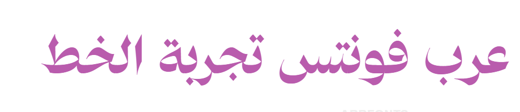
: Arabic Typesetting

10/10 نسبة الاستخدام
بواسطة : Mamoun Sakkal, Paul C. Nelson and John Hudson
حقوق الملكية :
الشركة :
منذ : 8 سنين
نوع الملف :ttf
وزن الخط :Regular
رابط المصمم :http://www.microsoft.com/typography/fonts/ats.htm
ArabicTypesetting Arabic Typesetting Al-Rbyt At-Tndyd ارابيك تيبستينغ Arabic Typesetting العربية التنضيد Arabic Typesetting Al-Rbyt At-Tndyd
Arabic Typesetting is a new design in the Naskh style, particularly well suited for traditional book typography, an area neglected by digital type. The font provides fine typographic control by marrying the latest OpenType technology to traditional calligraphic and typographic models. It achieves maximum readability by opening bowls and counters, balancing the proportions of stroke and white space in letters that typically cause problems at small sizes, and by contextually differentiating similar forms. The font contains over 2,100 glyphs, including contextual alternates, ligatures, and language-specific forms. Great care was taken in the design and digitization of all outlines. The graceful curves, the dynamic of blunt and rounded terminals, and the contrast between thick and thin strokes are consistent and lively throughout the typeface. In addition to providing all the correct shapes for quality Arabic typesetting, the same care and consistency has been applied in glyphs used for the many other languages, such as Farsi, Urdu, Sindhi, etc., that are written in variants of the Arabic script. This means that documents incorporating several language will have a harmonious appearance. The Arabic glyphs are accompanied by Latin letters designed to achieve a balance of color, weight and proportion between the two scripts. Typically, the trend in co-ordinating Arabic and Latin types has been to unhappily force the Arabic to match the proportions of the Latin. In this font, likely for the first time, the Latin has been adjusted to harmonize with the Arabic: the ascenders and descenders have been lengthened to echo the proportions of the Arabic extenders, and the usual impact of capital letters has been reduced by making them a similar weight to the lowercase.
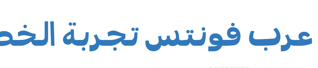
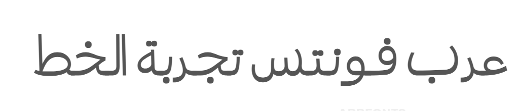
خطوط مشابهة
بعض الخطوط المشابهة ٣